
The Student Room - Redesign and rebranding
40% increase in new sign ins with in 6 months of redesign release - directly elevating key product metrics and contributing to company growth
TSR Vision
A world where every student discovers and reaches their potential
Overview
Redesign of The Student Room solved many problems that manifested over the years. It aimed to modernise the site by bringing in the new design system and brand to the forefront and was migrated from old tech stack to the new tech stack using react and react native.
My role
2 UX designers were a part of this project but I led design for key pages like home, thread, search, data capture which have heavy traffic on site.
Interaction designer
Visual designer
Prototype
Design system
User testing
User research
Approach


Desktop web
Mobile web

Defining the goals
Tools
After a couple of meetings and a workshop with the team and stakeholder, we had a solid understanding of the project goal and expectations. This acts as a guideline to our research phase and helped us create questions that are catered towards the end goal. We broke down further the goals into 3 categories.
Build trust, safety & credibility
Users should feel safe, confident, and assured that the advice and content they see is accurate and reliable.
Create a Personalised & Relevant Experience
Users should find relevant content, control over their experience, and to feel understood.
Site audit
Having a clear understanding of the project’s expectations, our first research phase was doing a site audit and researching further about user’s frustrations when using their current website. Some of their pain points were pointed out as follows
Users felt the website was cluttered and overwhelming, especially when compared to other websites like reddit and other competitors.
Website looks disorganised
Content difficult to read - especially white on blue and blue on white is hard to read
Mobile users said the buttons are too small to interact
Users unanimously agreed that The Student Room looked visually dated and out of touch with modern website design
The site was slow to load when compared to other sites, and people were bouncing.
Getting to know our users…
Our data showed that most users browse using mobile, therefore, we decided to go with a mobile-first design approach to optimise the user’s mobile experience.

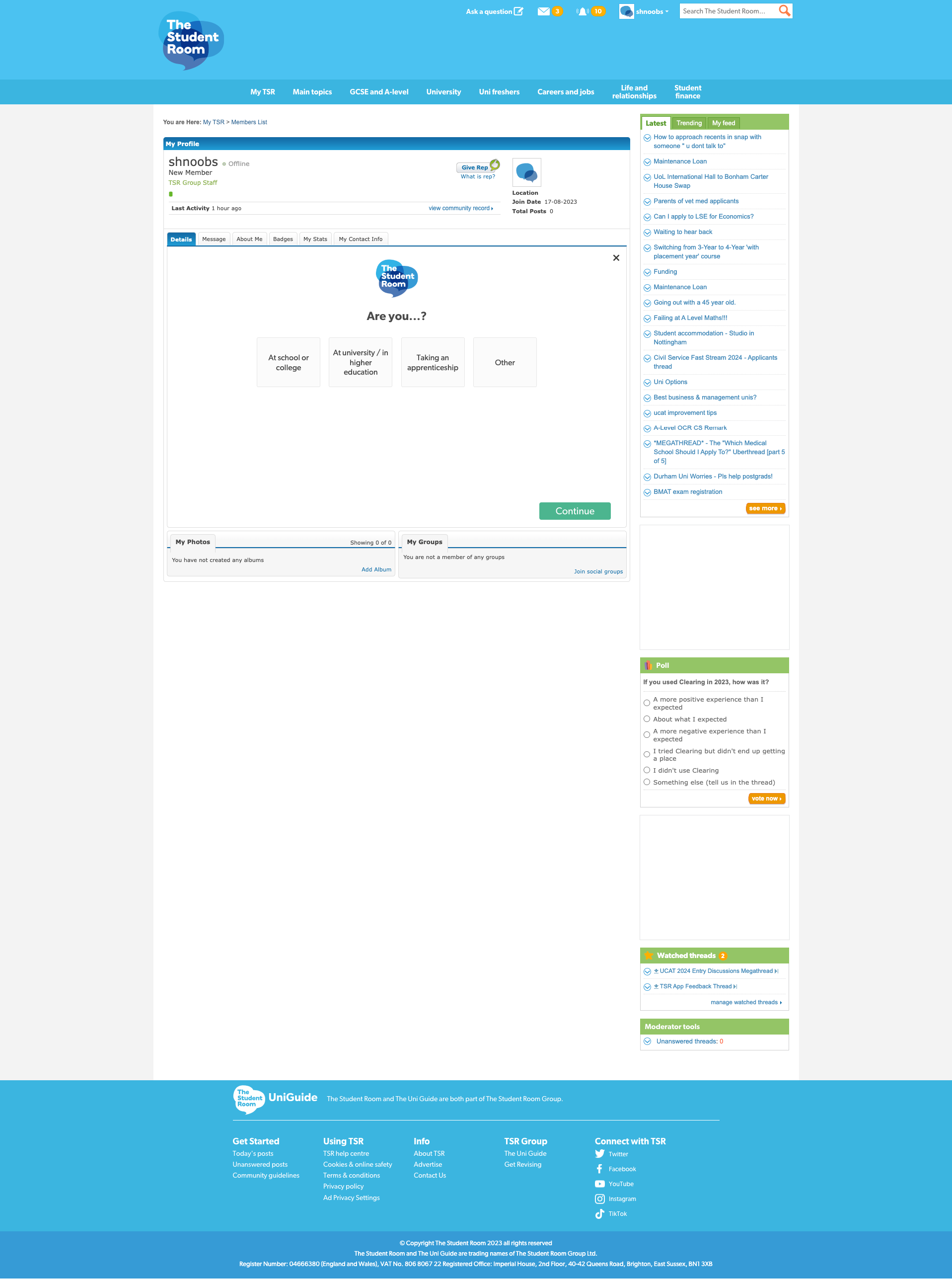
Previous site
Persona development


Ideation workshop

Design system
Boost Enjoyment, Community & Engagement

6 personas were developed to cover all the kinds of users on The Student Room
Information architecture
Platforms
Users should enjoy the platform, come back often, and feel part of a modern, welcoming, and active community.


Next, after getting a good idea of our goals, challenges, personas, we brainstormed data-driven solutions in the form of features which were then presented to the stakeholder during our meeting. The stake holder then categorised the features into three classes, Must Haves, Nice to Haves and Not Needed. By the end of this exercise, we understood further our priorities and has greatly helped us with arranging the site’s Information Architecture.

After solidifying our information architecture we then jumped right away to designing components and built a design system with the new brand colours (branding was done by a third party agency) we used the colours, logos to build the library.
Sample only


Iterations and testing

1 round of Prototype testing was held, with a mix of super users and new users and designs were iterated according to the findings.
Iteration 1

Figma
Story book
Miro
Jira
Adobe illustrator


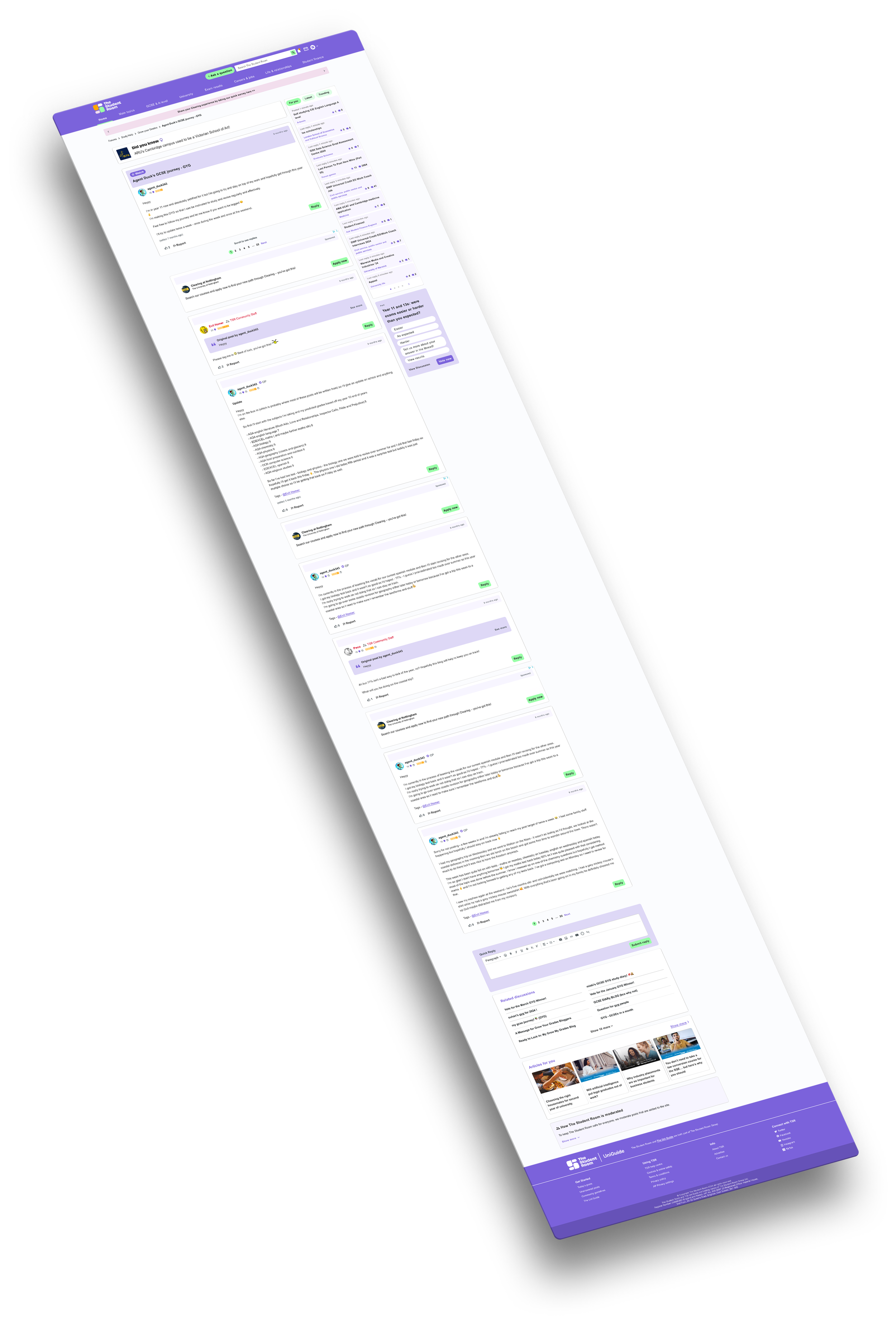
Final designs (does not showcase all the screens)

Solutions
Wrapping up our research findings and after usability testing, below are the solutions we concluded - which also includes separate elements on different key pages of the site
Verified content indicators and expert-backed advice made users feel confident that what they’re reading is accurate.
Clear community guidelines, improved moderation workflows including AI moderation create a safer environment, reducing harmful or misleading content.
Trust badges and transparency around reporting helped users feel protected and supported.
Smart content recommendations based on interests, behaviour, and goals ensured users always see what matters to them.
Inclusive onboarding flows that ask about aspirations, academic level, and needs create tailored journeys.
A modern visual refresh (updated UI, cleaner layouts, mobile-first design) improved usability and perception.
Features supporting community interaction (badges, reactions, tagging, polls, quick replies) made it easier and more enjoyable to take part.
Full design for the site can be viewed on www.thestudentroom.co.uk