Respondent app
iOS
Android
Android
100% gain
Achieved growth in unique users, rising from 150K to 300K.
Android
Huawei
Addressed legitimacy concerns to improve user perception and client satisfaction, while strategically strengthening data collection capabilities to reduce turnaround times.
Saved £750K in unnecessary payouts within just 4 months.


21% higher
User engagement boost led to 30% more response submissions.

Final designs
£48K saved
15% response quality increase led to reduced manual cleanup time.


4.1 rated
Raised app store rating, from a baseline of a low 2.7 average.


27% boost
Sales acquired high-profile clients such as Facebook and Shell.


Timeline
Feb 22 - Mar 23
Role
Product designer
Tools
Figma, Adobe, Pendo, Lookback, Miro, Jira
Context
GrapeData creates a balanced ecosystem that delivers value to both clients (B2B) and respondents (B2C), enabling mutual benefits. Clients commission GrapeData to conduct research in niche markets globally, driven by the quick turnaround, high-quality data, and the ability to trace responses back to individual participants. Respondents, in turn, are motivated by the opportunity to share their knowledge and earn higher rewards than offered by competitors. To facilitate this exchange, GrapeData collects, processes, analyses, and outputs data into actionable dashboard for clients. However, there was an internal challenge in meeting response times and targets, causing Project Managers to work long hours to ensure the quality of data delivered to clients. My task was to identify the root cause of this issue and find a solution.
The team
Split into two squads:
Chief Technical Officer x1
Product Manager x1
Project Manager x1
FE engineers x3
BE engineers x5
QA testers x1
Product designer x1
(Poornima Adabala)

The approach
Discovery
Workshops were held to align user and business needs, ensuring that both perspectives were considered in the development of solutions and strategies. This collaboration aimed to identify pain points, prioritise goals, and foster a deeper understanding between stakeholders to drive more effective outcomes. I found that most of the Product related business and user pains can be categorised in to the following:

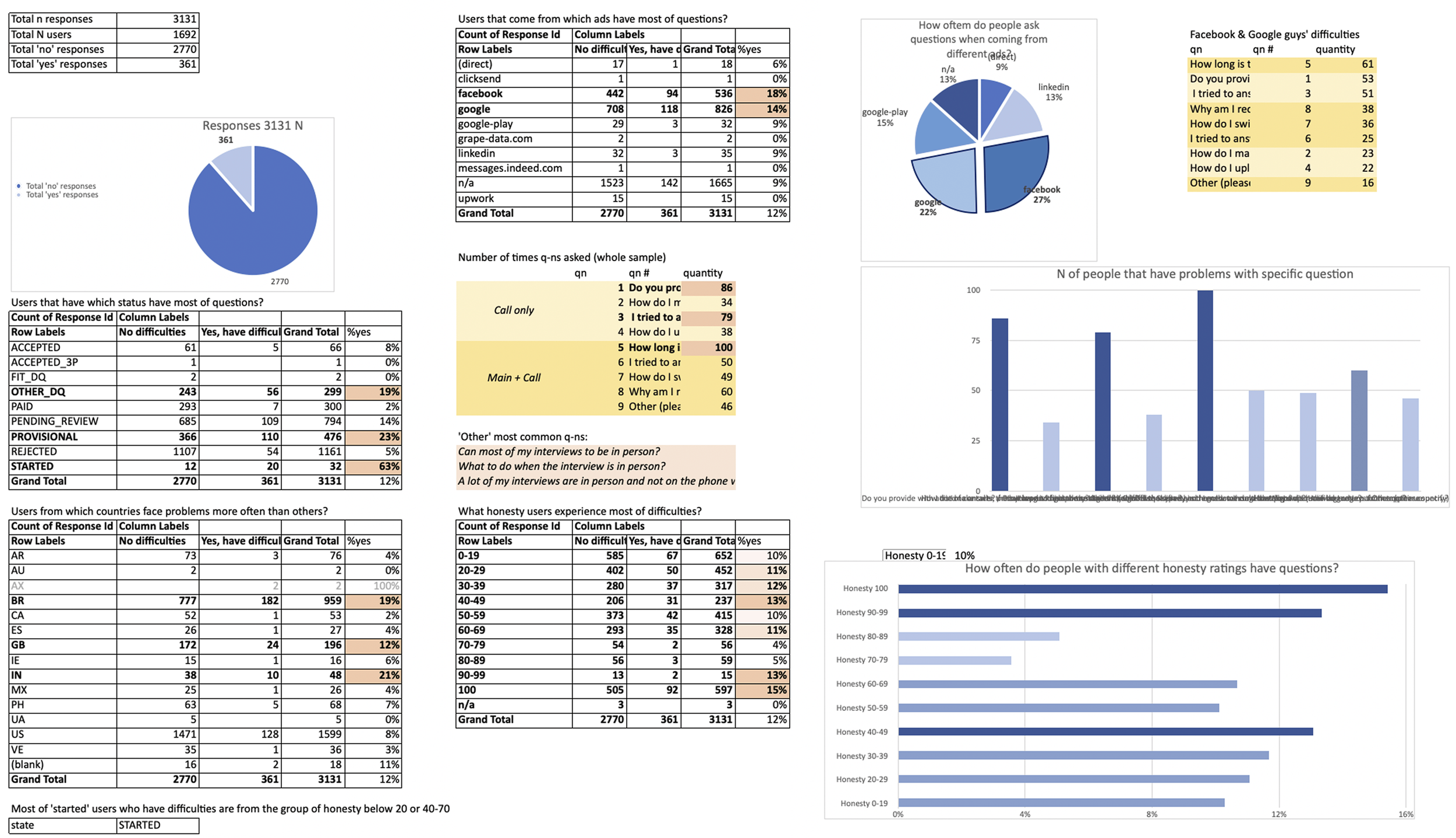
Data was collected from Project Managers to gain insight into the issues within the user journeys and to analyse task completion methods and rates.
Following the workshops and data collection, I also gained valuable insights by speaking to users about what users liked, disliked, and what features they wanted in future iterations of the app. This feedback allowed us to prioritise improvements and better align the app’s development with user expectations.

Previous app
Screenshots
In the previous app, the issues went beyond aesthetics. There were significant accessibility challenges and broken user journeys that prevented users from completing tasks smoothly. We found that a lot of users were abandoning the process or not submitting correctly due to confusions in the journey. Additionally, there was no centralised space for housing user profiles, resulting in a cost of £5 per user (with 120K users at the time). This inefficiency was frustrating for Project Managers, who had to manually upkeep user records for Client task matching purposes.

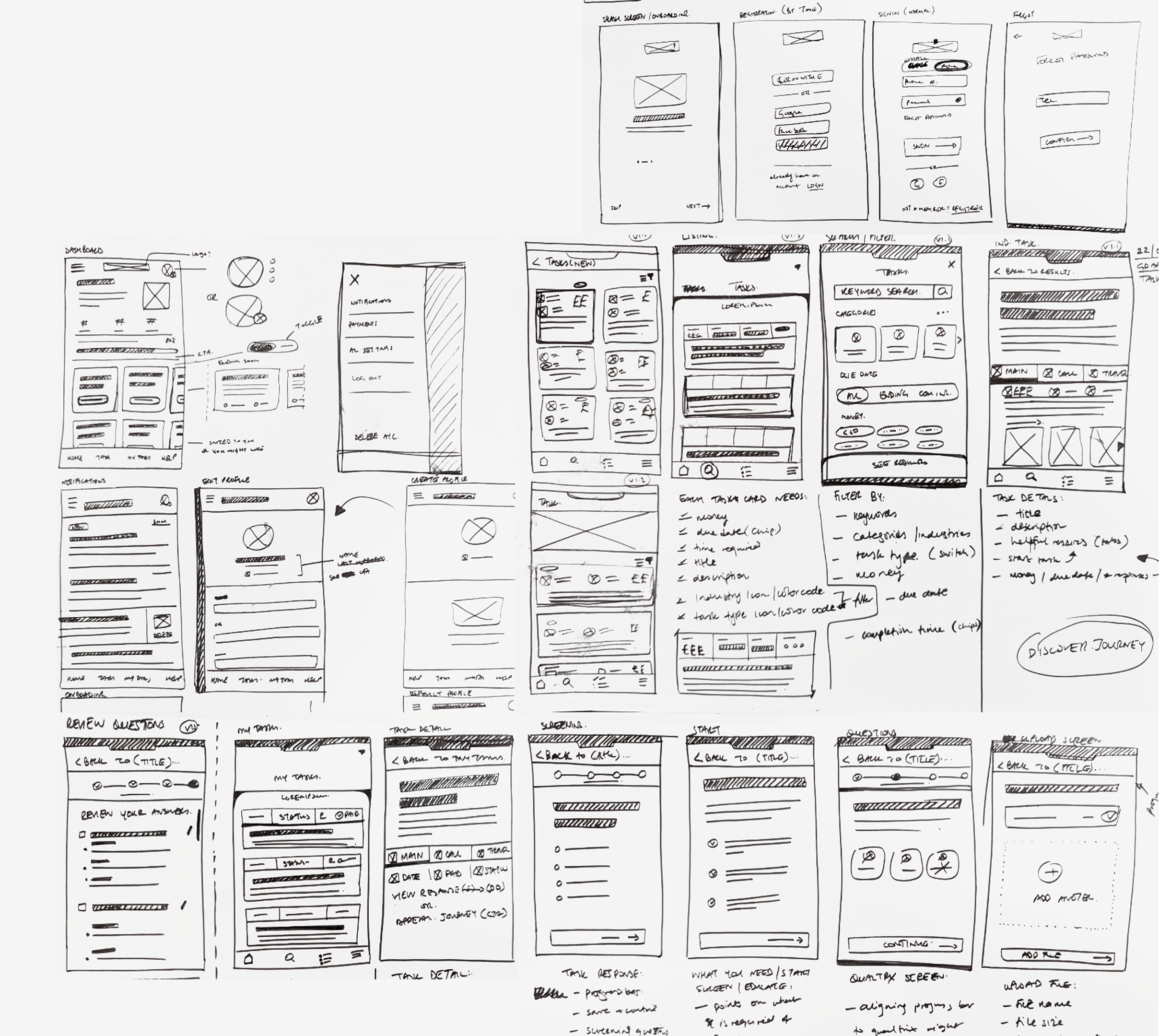
Userflow
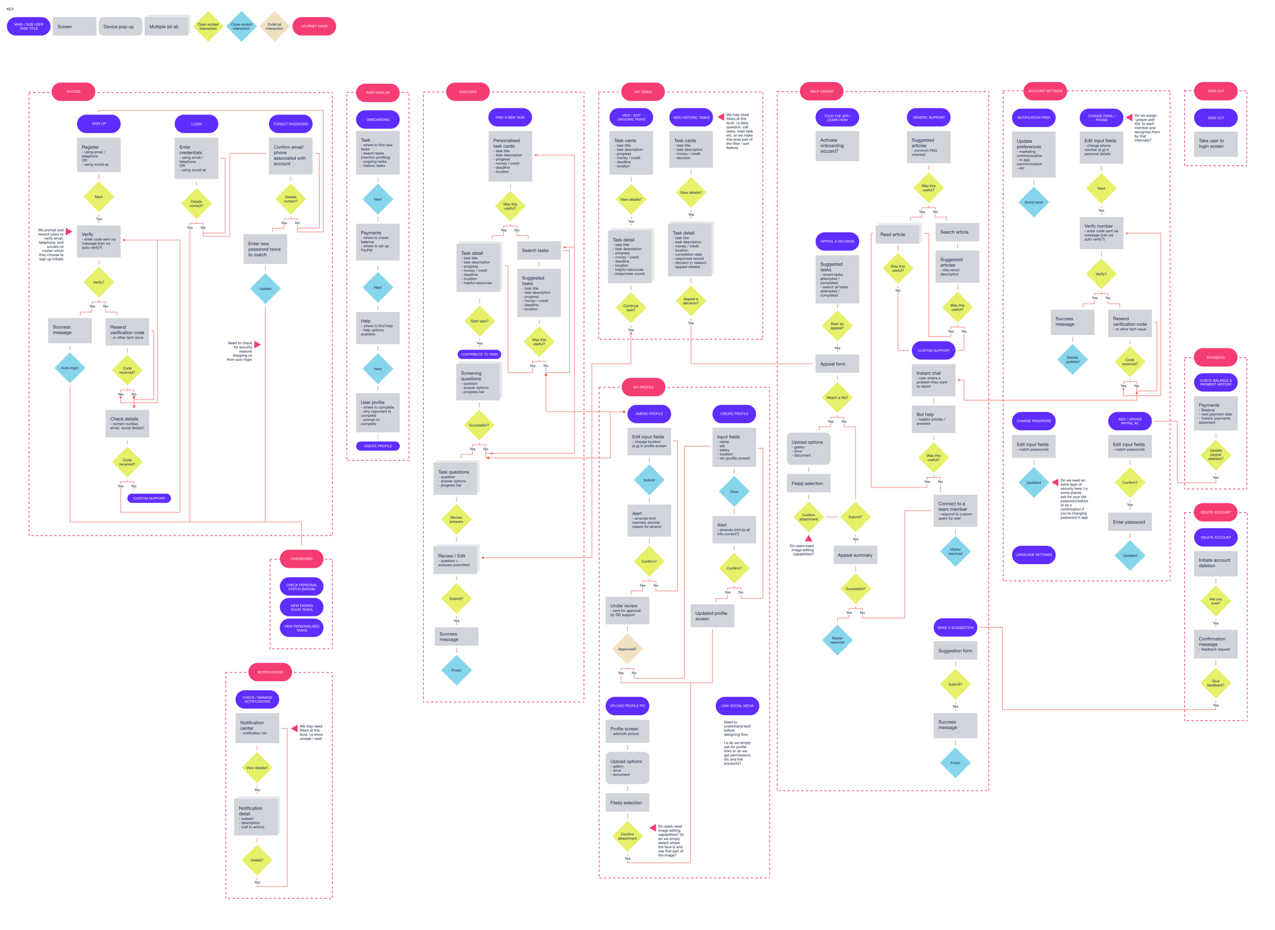
Concept sketches
The following were used to discuss user flows and journeys with the product, engineering teams, and stakeholders. Internal feedback and buy in were crucial in shaping the app’s future direction. I prioritised ideas from feedback and workshops using the MoSCoW method, while also factoring in time and technical constraints to develop the concepts..
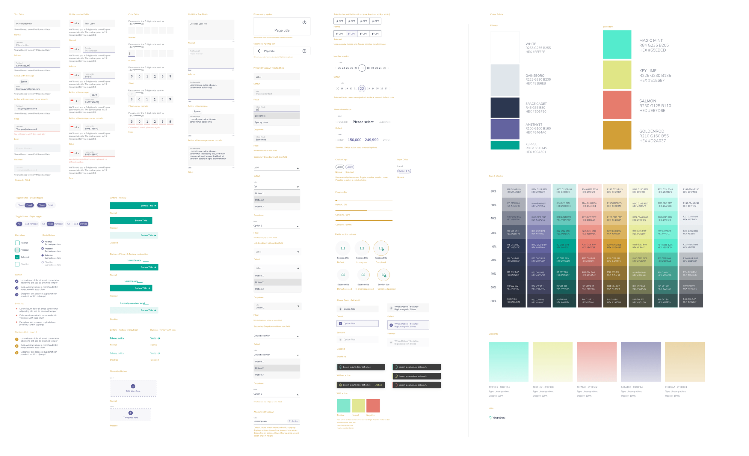
Design system
(Sample only)
Iterations & testing
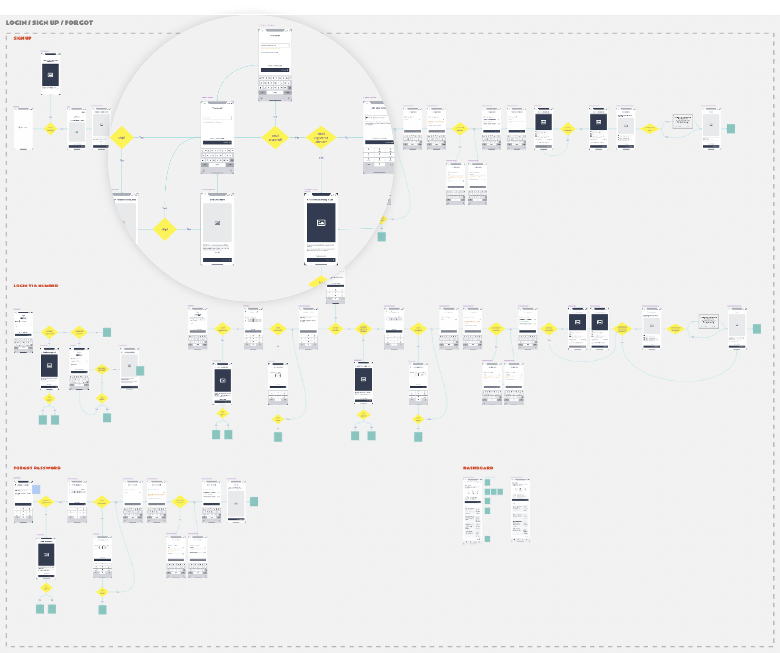
Hi-fi wireframes
3 rounds
Three rounds of Prototype testing held, both internally and externally as designs were iterated upon.
C-suite buy in
At least one round was held with C-suite stake holders and reports from each round were shared with the business.
Documentation
User-flows, Jira ACs, and other relevant docs (e.g PRD, Roadmap) were updated to reflect the changes.
Visual designs
2 rounds
Two rounds of Prototype testing held, both internally and externally as designs were iterated upon.
C-suite buy in
At least one round was held with C-suite stake holders and reports from each round were shared with the business.
Documentation
User-flows, Jira ACs, and other relevant docs (e.g PRD, Roadmap) were updated to reflect the changes.

Solution
Growth
Improved ads
Templates changed across Google and all Social media.

Communication improved
App Store listing improved. NPS (Net promoter score score tracked and user reviews improved. Entire app translated into 6 languages.
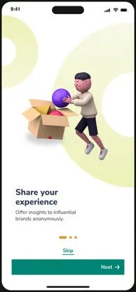
Onboarding
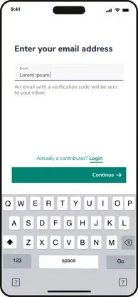
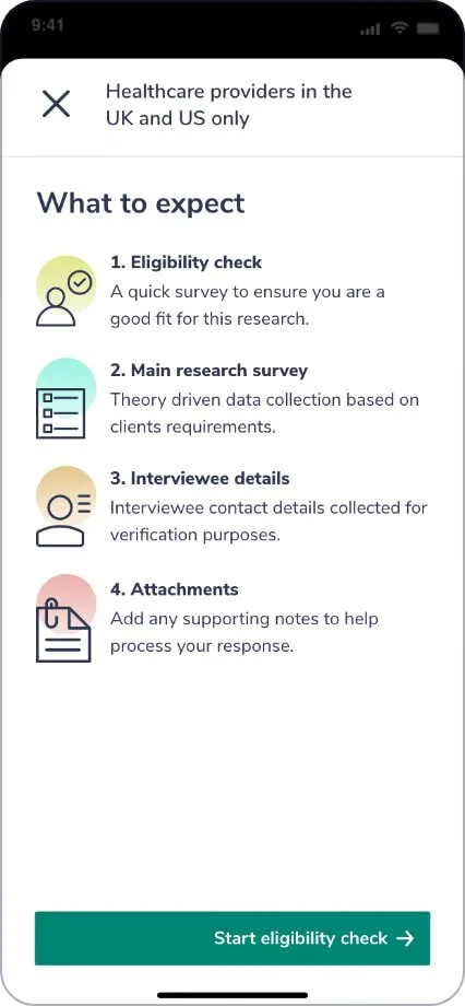
Introduced helpful information during onboarding, to guide users about product offering and through sign-up.
Engagement and Retention
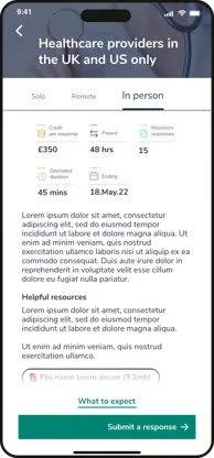
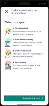
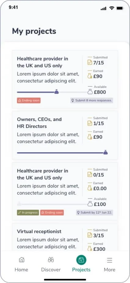
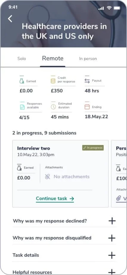
Task submission process improved, allowing for more responses to come through successfully.
Users informed of what to expect in a task, as well as onboarding journeys introduced to ensure users understood how it works.
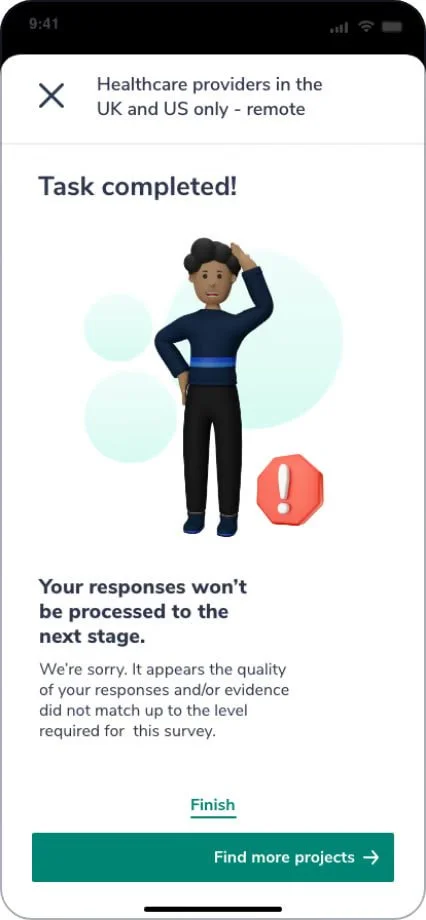
Transparency introduced when task submission was rejected.
Empathetic and informative copy written instead of the unhelpful copy previously.
User’s ability to manage historic projects was also improved.
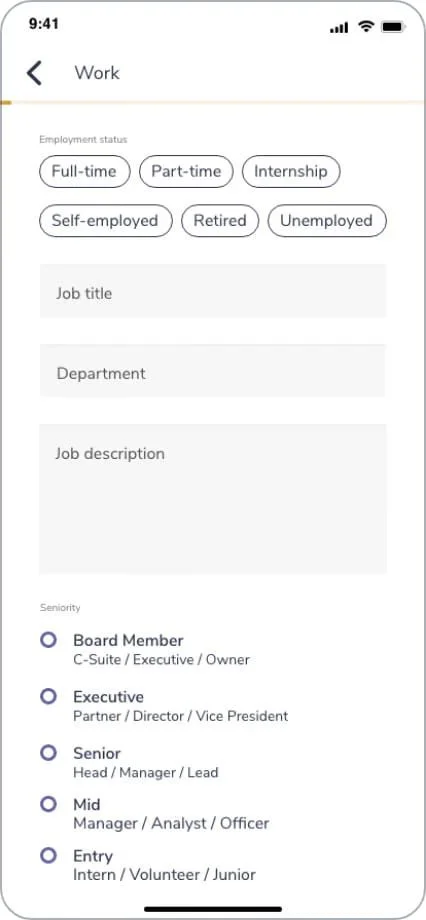
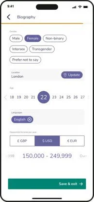
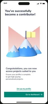
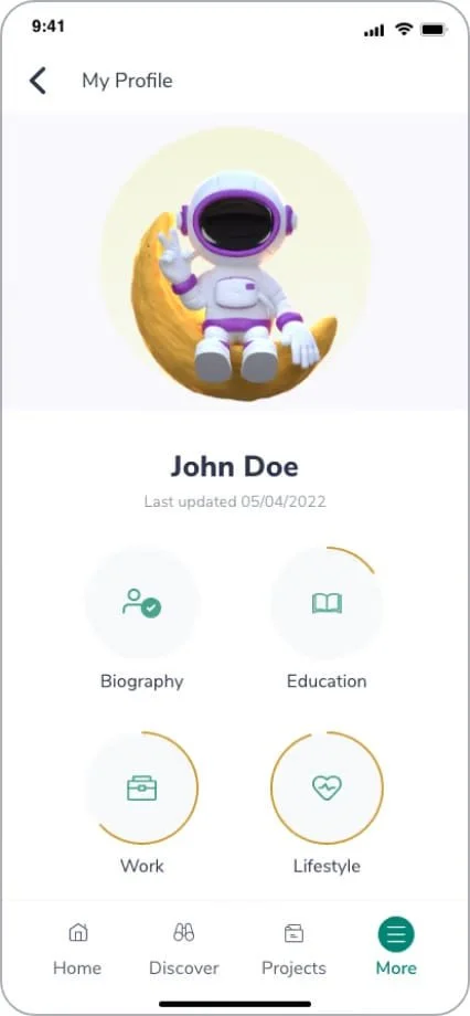
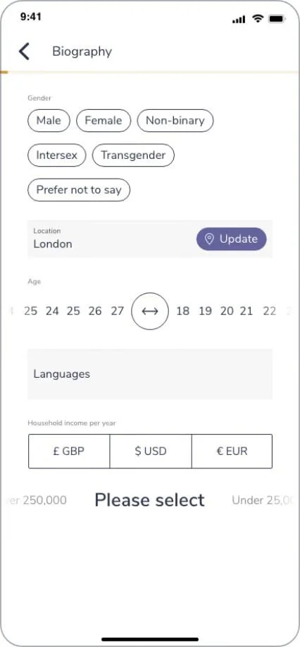
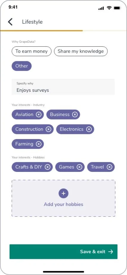
Giving users control over their profiles, allowing for more accurate matching to tasks.
Users given control of their profile enabling them to keep it up to date. This helps with more accurate matching to tasks.
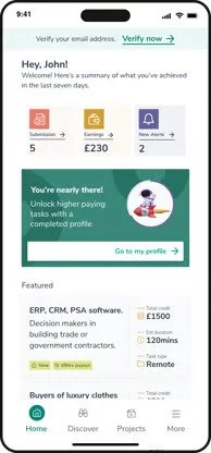
Users reported that gamification of the profile section motivates them to complete it.
User’s excitement to complete profile is equally beneficial clients as this information is used for data verification.
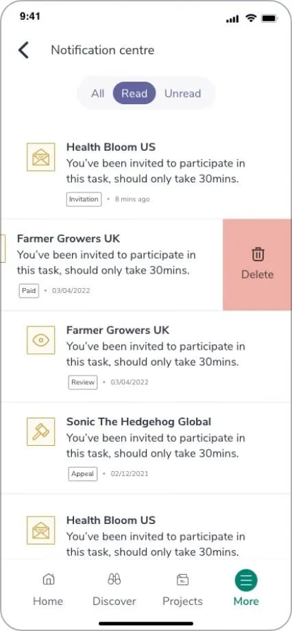
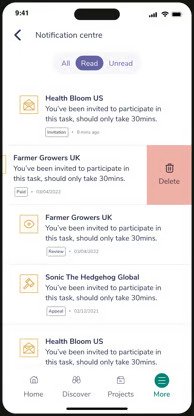
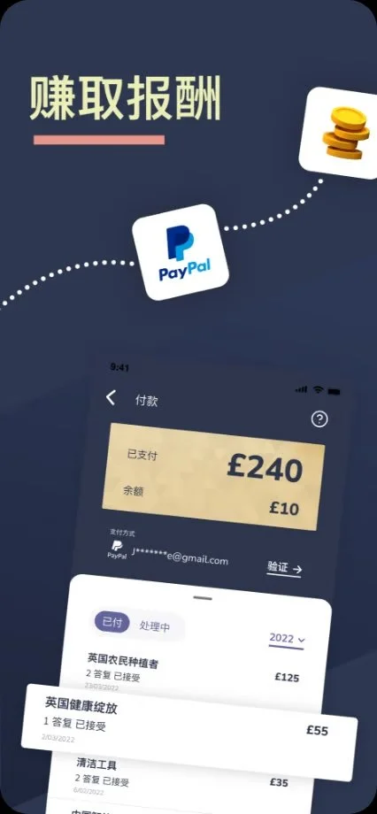
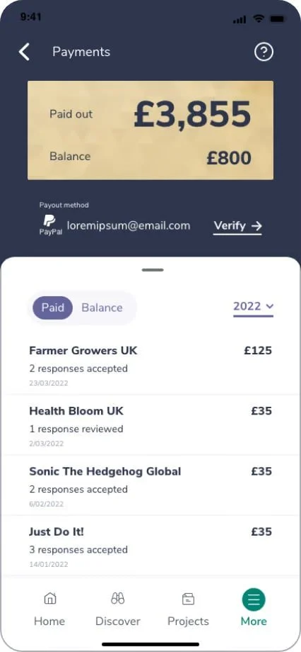
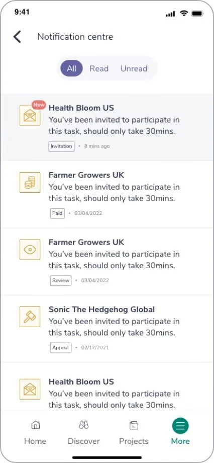
Transparency around payments and updates via a Notification centre.
Allowing users to see where their payment is, thus reducing anxiety and helped change perception around GrapeData’s legitimacy.
Notifying users of task availability and providing direct links to the tasks helped increase response rates.